Weborama
Weborama
Weborama
Weborama
Weborama
Weborama
Weborama
Weborama
Redesigning a creative platform for a digital advertising solution
Role: UX, UI Designer
Time: 4 weeks
Tools: Figma
Redesigning a creative platform for a digital advertising solution
Role: UX, UI Designer
Time: 4 weeks
Tools: Figma
Redesigning a creative platform for a digital advertising solution
Role: UX, UI Designer
Time: 4 weeks
Tools: Figma
Redesigning a creative platform for a digital advertising solution
Role: UX, UI Designer
Time: 4 weeks
Tools: Figma
Redesigning a creative platform for a digital advertising solution
Role: UX, UI Designer
Time: 4 weeks
Tools: Figma
Redesigning a creative platform for a digital advertising solution
Role: UX, UI Designer
Time: 4 weeks
Tools: Figma
Redesigning a creative platform for a digital advertising solution
Role: UX, UI Designer
Time: 4 weeks
Tools: Figma
Redesigning a creative platform for a digital advertising solution
Role: UX, UI Designer
Time: 4 weeks
Tools: Figma
Project Overview
Weborama is a leading French marketing technology company known for its expertise in semantic AI, marketing data collection, and online advertising campaign distribution throughout Europe. They offer a range of state-of-the-art technologies and solutions designed to help publishers, agencies, and advertisers optimize the effectiveness of their digital advertising and marketing campaigns. Among their offerings is Weborama Studio, a creative platform that provides users with the possibility to customize their existing advertising templates and integrate their new publications seamlessly into advertising platforms.
Background
During the course of this project, I was tasked with redesigning the homepage of the Weborama Studio creative platform and streamlining the process for filtering publications. In a collaborative stakeholder meeting attended by Cedric, the product manager, David, the artistic director, Julie, the customer success manager, Pierre, the head of publishers, and myself, I gained valuable insight into the challenges and pain points experienced by Weborama Studio users.
The homepage, which currently contained only a graph of the overall monthly campaign statistics, did not provide any other information or filtering options. This graph was also available in the dashboard, making it redundant.
The design of the platform was old-fashioned, outdated and not user intuitive.
There were several help and support buttons and links on the homepage, with two of them leading to the same help documentation.
The filter options in the Publications section were difficult to navigate and were not labeled clearly.
Taking this all into account, my objective was to enhance the homepage by adding detailed campaign information, new filtering options, intuitive support, and a modern design, as well as improving the publication filter navigation and labeling for a better user experience.
Empathize
USER SURVEY AND INTERVIEWS
While I had great insight from the stakeholders into the issues that users were facing with Weborama Studio, it was crucial to dig deeper and speak to the users themselves. I began by administering a user survey that gathered feedback from both existing clients and external professionals within the advertising industry. I then interviewed 5 current users of the platform and asked them a series of open-ended questions to better understand their pain points. I learned that:
in addition to the lack of clear filter options for publications, there was no way to distinguish whether or not a publication was currently live
there were too many tabs in the navigation menu with some being irrelevant, and some sections seemed to be randomly placed. For example, user role settings appeared in the Dashboard tab.
it was not clear how to reach a specific team for assistance and some users felt they were spending too much time trying to understand how to get support

COMPETITIVE ANALYSIS
In addition to the user interviews, I analyzed the creative advertising platforms of some of Weborama’s top competitors to evaluate their strengths and weaknesses. This helped me to understand why a user might choose to use a particular platform over another.
COMPETITIVE ANALYSIS
In addition to the user interviews, I analyzed the creative advertising platforms of some of Weborama’s top competitors to evaluate their strengths and weaknesses. This helped me to understand why a user might choose to use a particular platform over another.
COMPETITIVE ANALYSIS
In addition to the user interviews, I analyzed the creative advertising platforms of some of Weborama’s top competitors to evaluate their strengths and weaknesses. This helped me to understand why a user might choose to use a particular platform over another.
COMPETITIVE ANALYSIS
In addition to the user interviews, I analyzed the creative advertising platforms of some of Weborama’s top competitors to evaluate their strengths and weaknesses. This helped me to understand why a user might choose to use a particular platform over another.
COMPETITIVE ANALYSIS
In addition to the user interviews, I analyzed the creative advertising platforms of some of Weborama’s top competitors to evaluate their strengths and weaknesses. This helped me to understand why a user might choose to use a particular platform over another.
COMPETITIVE ANALYSIS
In addition to the user interviews, I analyzed the creative advertising platforms of some of Weborama’s top competitors to evaluate their strengths and weaknesses. This helped me to understand why a user might choose to use a particular platform over another.
COMPETITIVE ANALYSIS
In addition to the user interviews, I analyzed the creative advertising platforms of some of Weborama’s top competitors to evaluate their strengths and weaknesses. This helped me to understand why a user might choose to use a particular platform over another.
COMPETITIVE ANALYSIS
In addition to the user interviews, I analyzed the creative advertising platforms of some of Weborama’s top competitors to evaluate their strengths and weaknesses. This helped me to understand why a user might choose to use a particular platform over another.

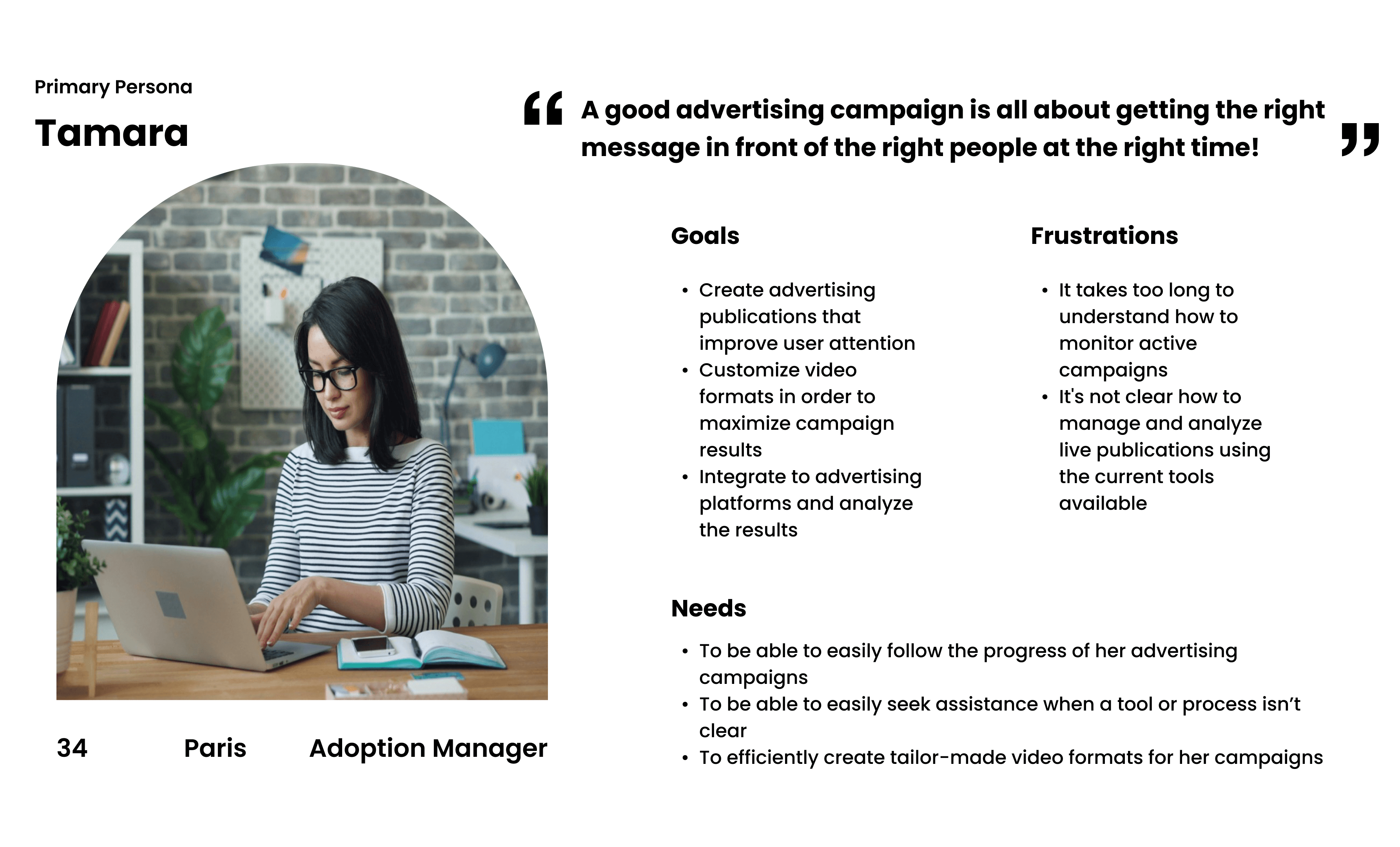
USER PERSONA
After analyzing the data from my research, I developed a user persona that would represent the user I am designing for and would help to guide my design decisions. Meet Tamara:
USER PERSONA
After analyzing the data from my research, I developed a user persona that would represent the user I am designing for and would help to guide my design decisions. Meet Tamara:
USER PERSONA
After analyzing the data from my research, I developed a user persona that would represent the user I am designing for and would help to guide my design decisions. Meet Tamara:
USER PERSONA
After analyzing the data from my research, I developed a user persona that would represent the user I am designing for and would help to guide my design decisions. Meet Tamara:
USER PERSONA
After analyzing the data from my research, I developed a user persona that would represent the user I am designing for and would help to guide my design decisions. Meet Tamara:
USER PERSONA
After analyzing the data from my research, I developed a user persona that would represent the user I am designing for and would help to guide my design decisions. Meet Tamara:
USER PERSONA
After analyzing the data from my research, I developed a user persona that would represent the user I am designing for and would help to guide my design decisions. Meet Tamara:
USER PERSONA
After analyzing the data from my research, I developed a user persona that would represent the user I am designing for and would help to guide my design decisions. Meet Tamara:
Define & Ideate
PROBLEM STATEMENT
With a deeper understanding of my target user and their goals and pain points, it was clear to me how to define my problem statement:
Advertising industry professionals need to streamline the process of creating and monitoring their advertising campaigns as they are currently spending too much time grappling with complex tools.
IDEATION
I then moved onto the ideation phase and used the crazy 8s method to brainstorm potential solutions. I also took into account the changes that the stakeholders let me know they wanted to see on the platform. Once I gathered all these ideas together, I used the MoSCoW method prioritization technique to decide on the improvements that I thought were essential to have. For a high quality user experience, I thought it would be beneficial to:
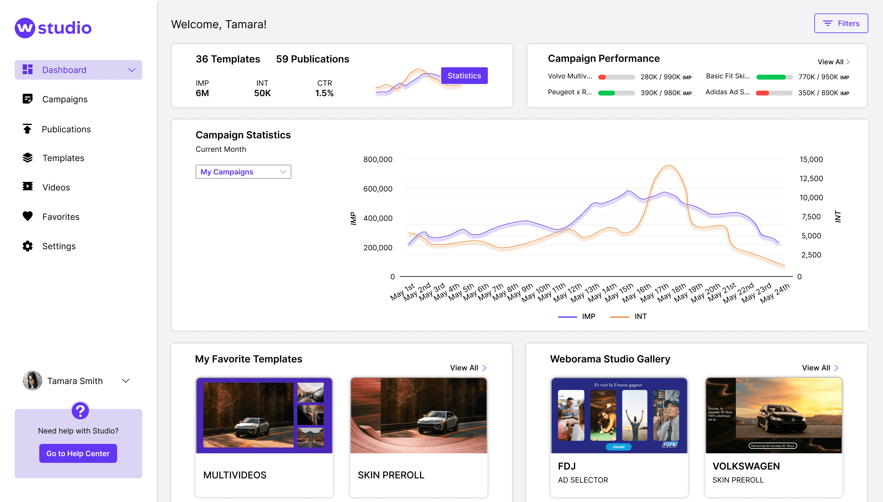
replace the current homepage with a new dashboard, allowing users to have filterable campaign and statistical information when they open the app
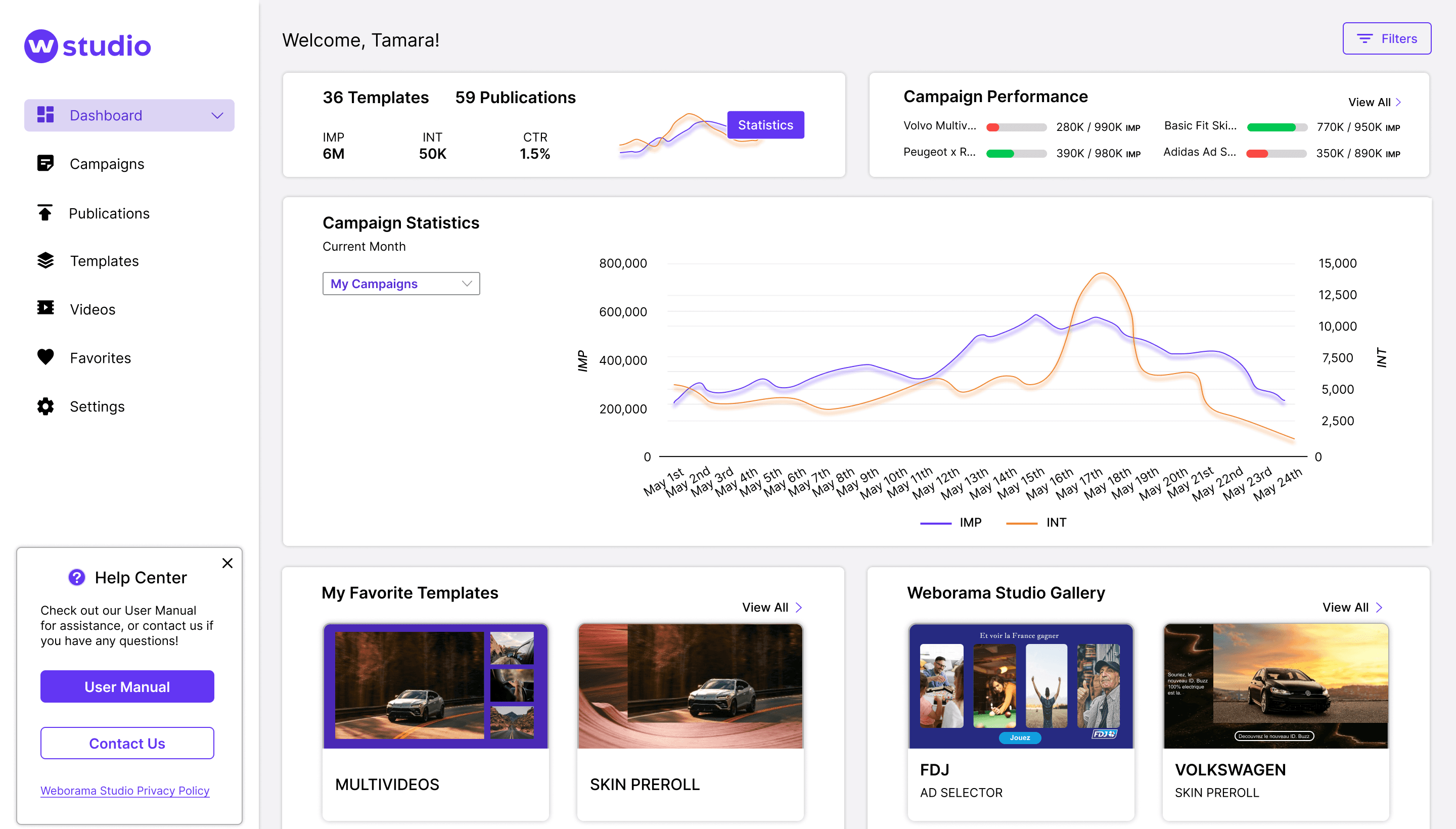
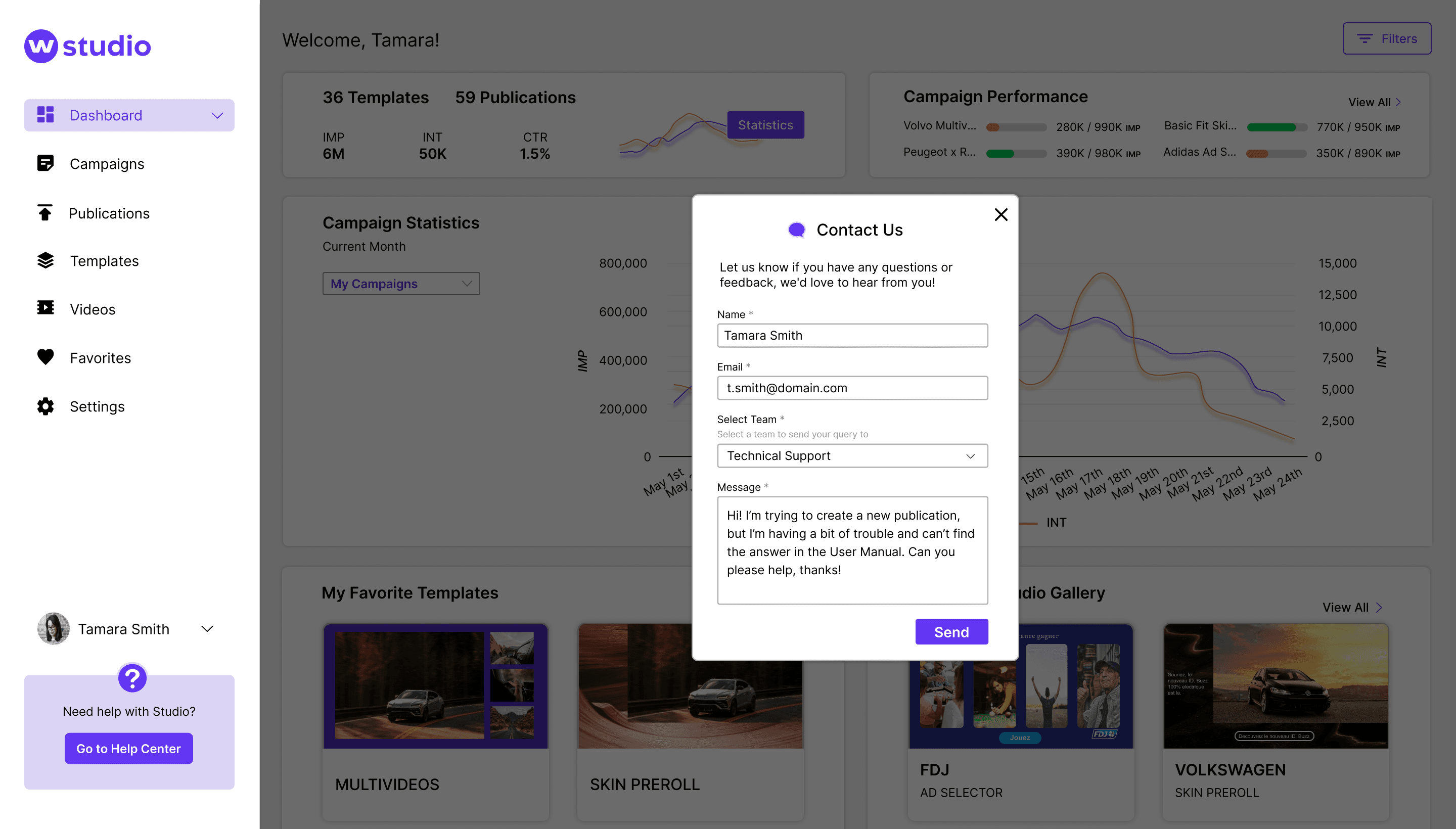
create a Help Center, where all support options live in the same place
condense the navigation menu to only include necessary and relevant options
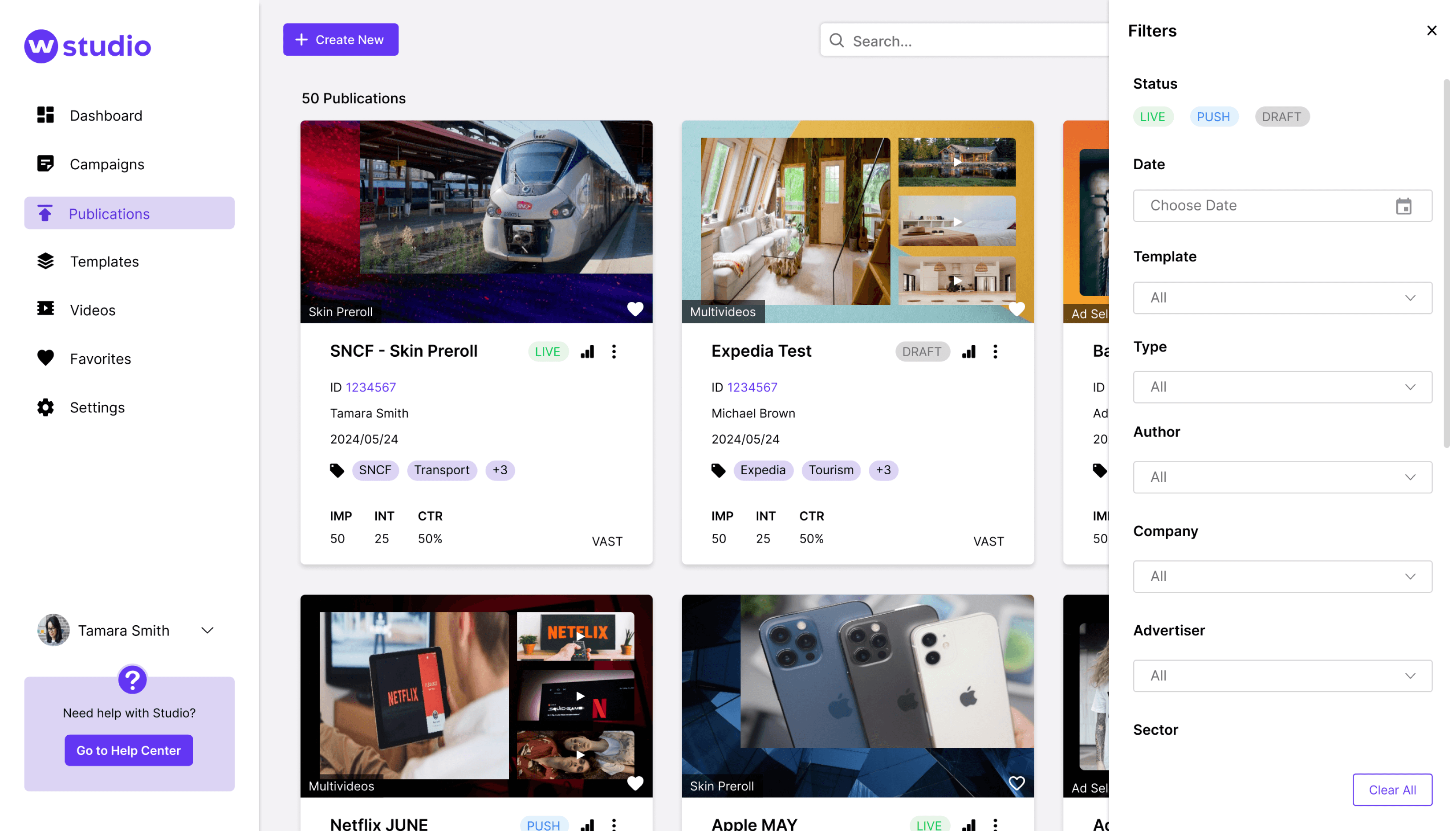
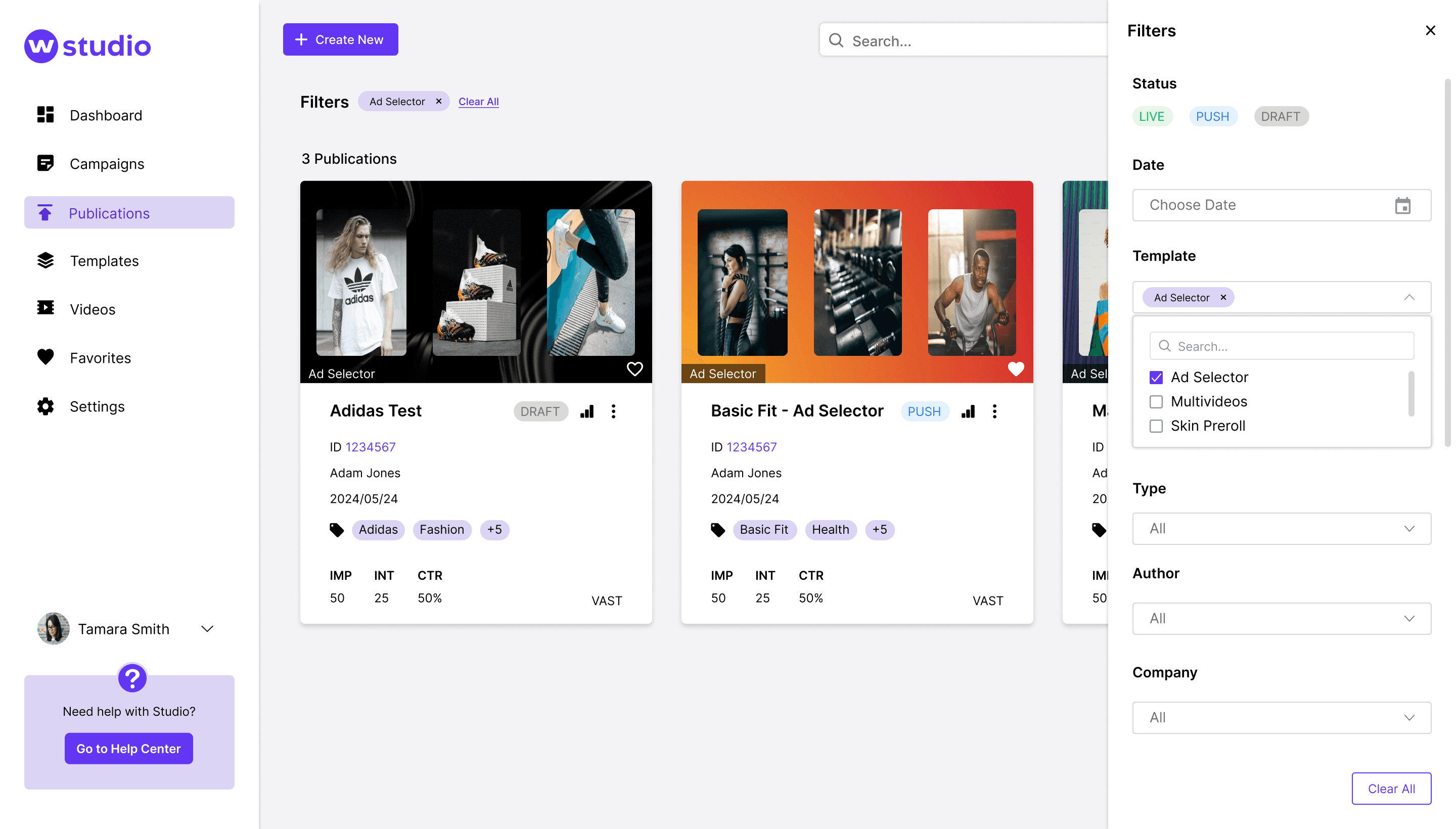
create new filter options for Publications with clear labeling and automatic filtering
add a status to publications so that users could easily tell when publications were live or still in progress
IDEATION
I then moved onto the ideation phase and used the crazy 8s method to brainstorm potential solutions. I also took into account the changes that the stakeholders let me know they wanted to see on the platform. Once I gathered all these ideas together, I used the MoSCoW method prioritization technique to decide on the improvements that I thought were essential to have. For a high quality user experience, I thought it would be beneficial to:
replace the current homepage with a new dashboard, allowing users to have filterable campaign and statistical information when they open the app
create a Help Center, where all support options live in the same place
condense the navigation menu to only include necessary and relevant options
create new filter options for Publications with clear labeling and automatic filtering
add a status to publications so that users could easily tell when publications were live or still in progress

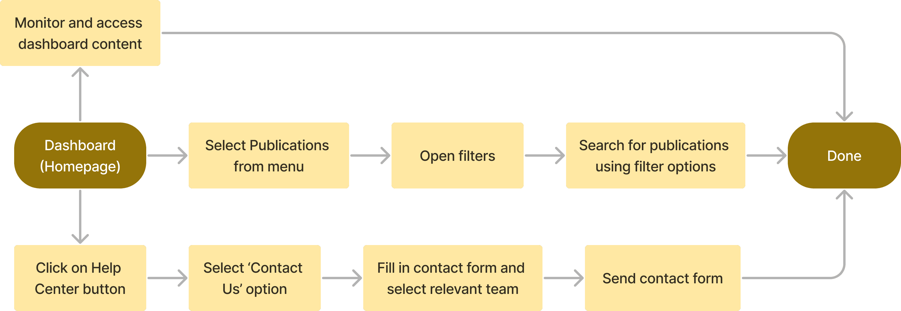
After determining which solutions were necessary, I proceeded to outline user flows that demonstrate the steps users would take to achieve their objectives in Weborama Studio. Starting from the dashboard, the first and simplest user flow shows what a user would do if they wanted to monitor their campaigns, statistics and other content directly from the dashboard. The second user flow illustrates how a user would search for a specific publication using the new filter options, and the last user flow outlines how users would reach out to Weborama for support by accessing the Help Center.
After determining which solutions were necessary, I proceeded to outline user flows that demonstrate the steps users would take to achieve their objectives in Weborama Studio. Starting from the dashboard, the first and simplest user flow shows what a user would do if they wanted to monitor their campaigns, statistics and other content directly from the dashboard. The second user flow illustrates how a user would search for a specific publication using the new filter options, and the last user flow outlines how users would reach out to Weborama for support by accessing the Help Center.
After determining which solutions were necessary, I proceeded to outline user flows that demonstrate the steps users would take to achieve their objectives in Weborama Studio. Starting from the dashboard, the first and simplest user flow shows what a user would do if they wanted to monitor their campaigns, statistics and other content directly from the dashboard. The second user flow illustrates how a user would search for a specific publication using the new filter options, and the last user flow outlines how users would reach out to Weborama for support by accessing the Help Center.
After determining which solutions were necessary, I proceeded to outline user flows that demonstrate the steps users would take to achieve their objectives in Weborama Studio. Starting from the dashboard, the first and simplest user flow shows what a user would do if they wanted to monitor their campaigns, statistics and other content directly from the dashboard. The second user flow illustrates how a user would search for a specific publication using the new filter options, and the last user flow outlines how users would reach out to Weborama for support by accessing the Help Center.
After determining which solutions were necessary, I proceeded to outline user flows that demonstrate the steps users would take to achieve their objectives in Weborama Studio. Starting from the dashboard, the first and simplest user flow shows what a user would do if they wanted to monitor their campaigns, statistics and other content directly from the dashboard. The second user flow illustrates how a user would search for a specific publication using the new filter options, and the last user flow outlines how users would reach out to Weborama for support by accessing the Help Center.
After determining which solutions were necessary, I proceeded to outline user flows that demonstrate the steps users would take to achieve their objectives in Weborama Studio. Starting from the dashboard, the first and simplest user flow shows what a user would do if they wanted to monitor their campaigns, statistics and other content directly from the dashboard. The second user flow illustrates how a user would search for a specific publication using the new filter options, and the last user flow outlines how users would reach out to Weborama for support by accessing the Help Center.
After determining which solutions were necessary, I proceeded to outline user flows that demonstrate the steps users would take to achieve their objectives in Weborama Studio. Starting from the dashboard, the first and simplest user flow shows what a user would do if they wanted to monitor their campaigns, statistics and other content directly from the dashboard. The second user flow illustrates how a user would search for a specific publication using the new filter options, and the last user flow outlines how users would reach out to Weborama for support by accessing the Help Center.
After determining which solutions were necessary, I proceeded to outline user flows that demonstrate the steps users would take to achieve their objectives in Weborama Studio. Starting from the dashboard, the first and simplest user flow shows what a user would do if they wanted to monitor their campaigns, statistics and other content directly from the dashboard. The second user flow illustrates how a user would search for a specific publication using the new filter options, and the last user flow outlines how users would reach out to Weborama for support by accessing the Help Center.
Prototype & Testing
LOW FIDELITY SKETCHES
With my solutions and user flows in place, I was ready to develop my low-fidelity diagrams illustrating these solutions.
Prototype & Testing
LOW FIDELITY SKETCHES
With my solutions and user flows in place, I was ready to develop my low-fidelity diagrams illustrating these solutions.
Prototype & Testing
LOW FIDELITY SKETCHES
With my solutions and user flows in place, I was ready to develop my low-fidelity diagrams illustrating these solutions.
Prototype & Testing
LOW FIDELITY SKETCHES
With my solutions and user flows in place, I was ready to develop my low-fidelity diagrams illustrating these solutions.
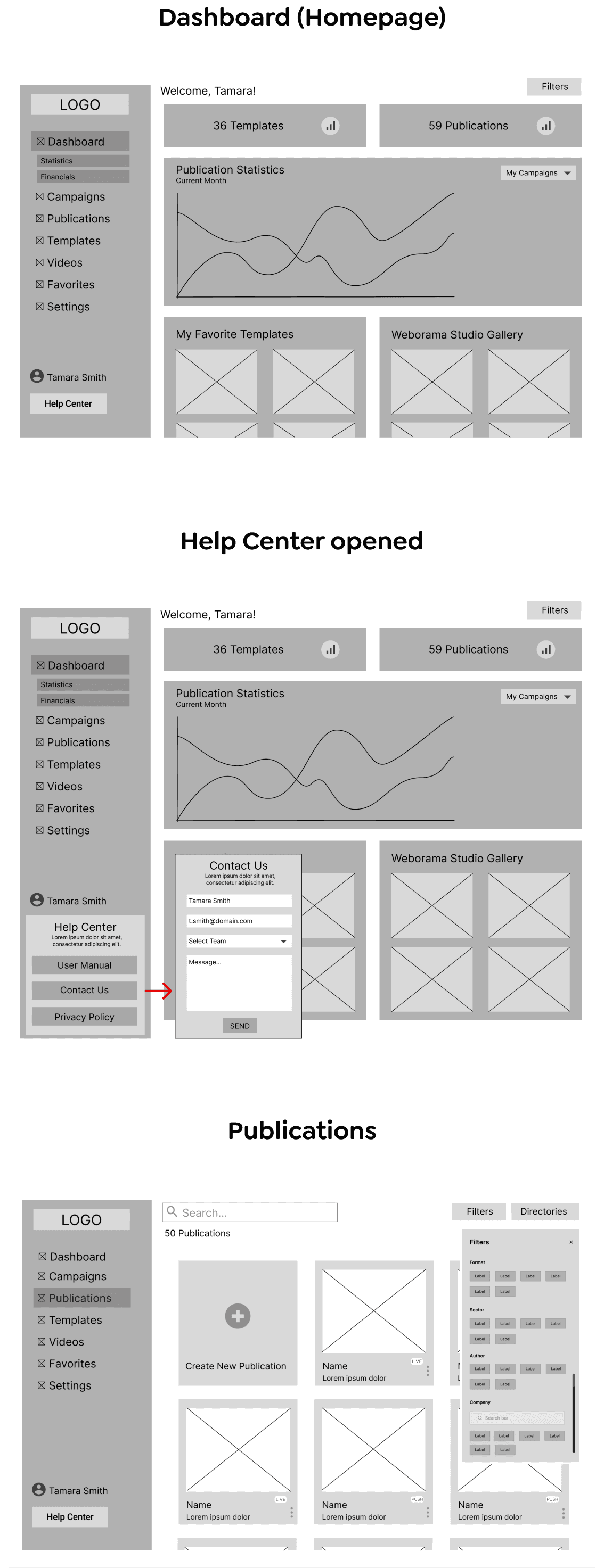
Prototype & Testing
LOW FIDELITY SKETCHES
With my solutions and user flows in place, I was ready to develop my low-fidelity diagrams illustrating these solutions.
Prototype & Testing
LOW FIDELITY SKETCHES
With my solutions and user flows in place, I was ready to develop my low-fidelity diagrams illustrating these solutions.
Prototype & Testing
LOW FIDELITY SKETCHES
With my solutions and user flows in place, I was ready to develop my low-fidelity diagrams illustrating these solutions.
Prototype & Testing
LOW FIDELITY SKETCHES
With my solutions and user flows in place, I was ready to develop my low-fidelity diagrams illustrating these solutions.


USABILITY AND CONCEPT TESTING
To ensure that my proposed solutions aligned with users’ needs, I conducted usability and concept testing on my low-fidelity designs with 5 current users of Weborama Studio. I also received feedback from a couple of the stakeholders, Cedric and Julie. Although I received mostly positive feedback, there were certain areas that needed improvement. For example, there were still too many options in the navigation menu, and several of them were not even accessible by the standard user. The dashboard content in my sketches also took up too much space and could be condensed to include other useful information, like the possibility for users to see their favorite templates directly on the dashboard. I took this feedback into account and made improvements to my low-fidelity sketches, as seen below.

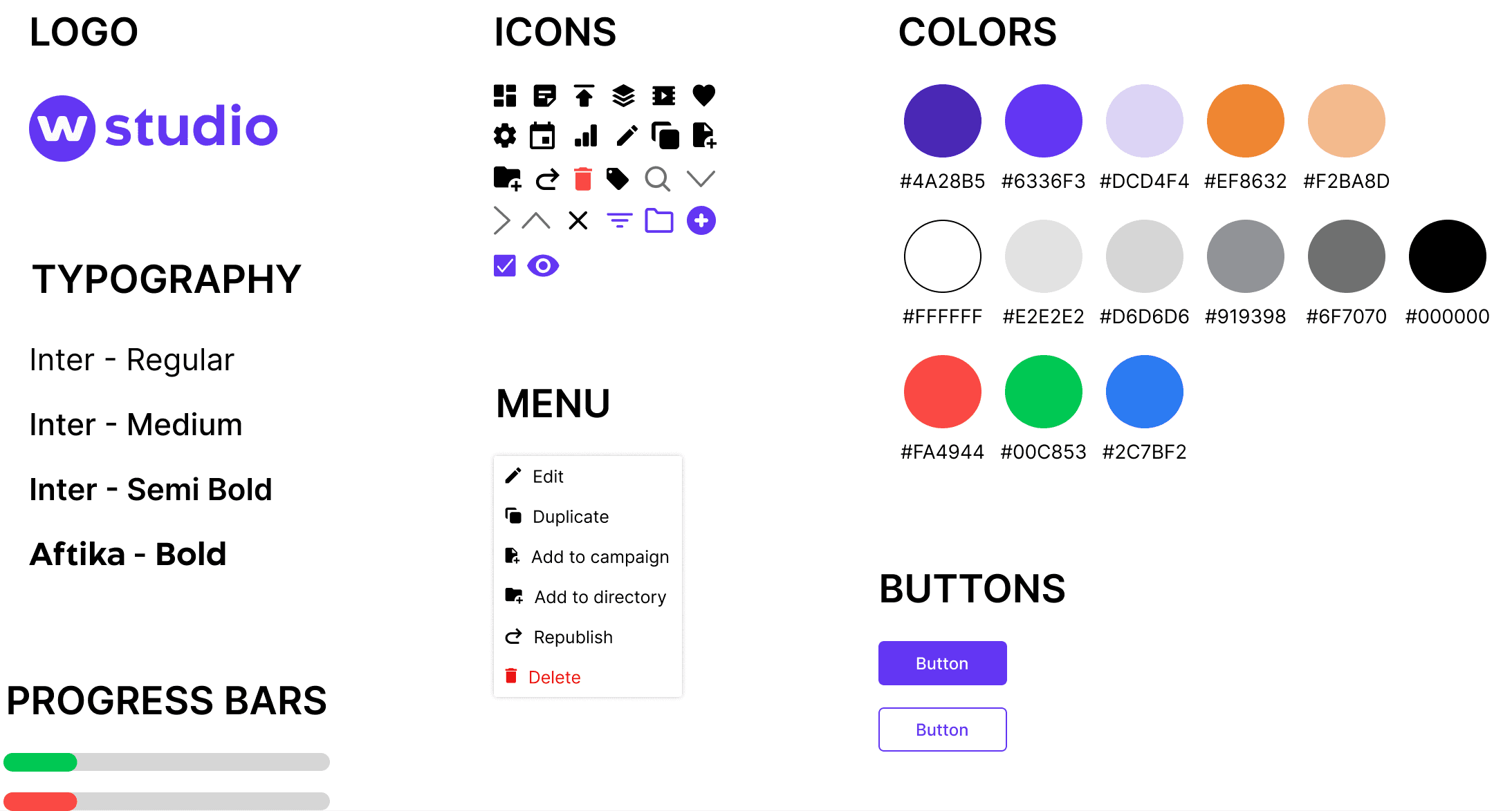
UI Design
STYLE TILE
Before moving on to my high-fidelity prototype, I needed to define Weborama Studio’s visual identify and how the UI would look. I wanted to make sure that my new designs adhered to the established aesthetic and tone of Weborama Studio by closely aligning them with the existing design system and brand colors. I developed a style tile to detail the updated buttons, icons, progress bars, menu structure, and semantic colors that would be integrated into my designs.
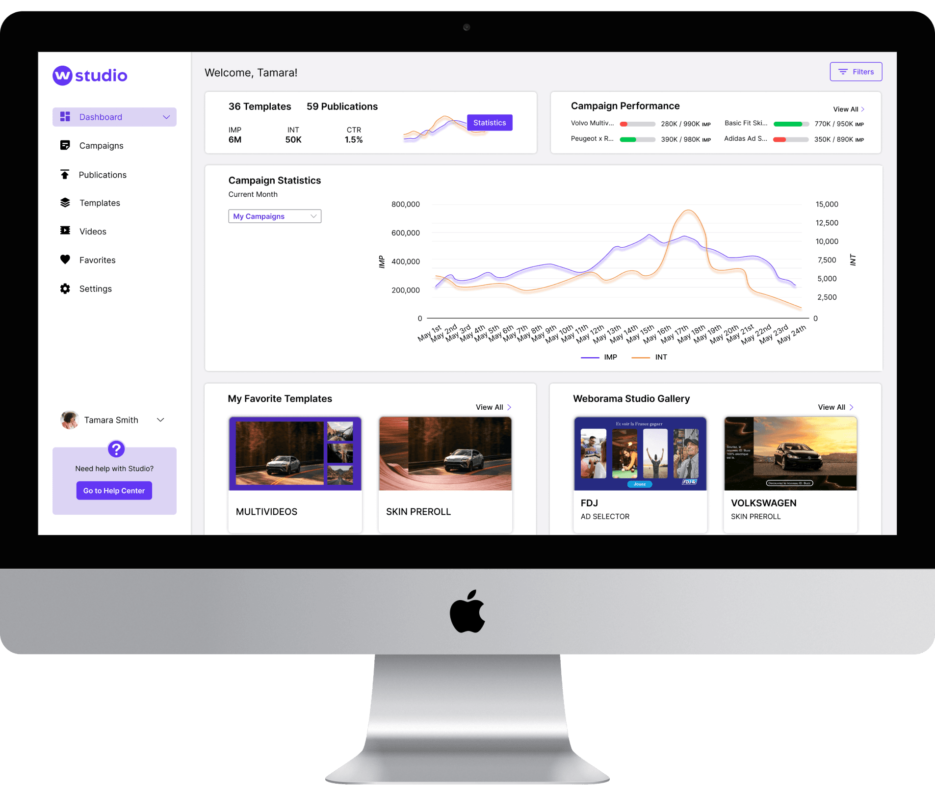
Final Prototype
Once I established the design of the UI, I moved forward with creating my high-fidelity prototype. You can view my finalized prototype here.
Final Prototype
Once I established the design of the UI, I moved forward with creating my high-fidelity prototype. You can view my finalized prototype here.
Final Prototype
Once I established the design of the UI, I moved forward with creating my high-fidelity prototype. You can view my finalized prototype here.
Final Prototype
Once I established the design of the UI, I moved forward with creating my high-fidelity prototype. You can view my finalized prototype here.
Final Prototype
Once I established the design of the UI, I moved forward with creating my high-fidelity prototype. You can view my finalized prototype here.
Final Prototype
Once I established the design of the UI, I moved forward with creating my high-fidelity prototype. You can view my finalized prototype here.
Final Prototype
Once I established the design of the UI, I moved forward with creating my high-fidelity prototype. You can view my finalized prototype here.
Final Prototype
Once I established the design of the UI, I moved forward with creating my high-fidelity prototype. You can view my finalized prototype here.

Conclusion & Takeaways
This was a new type of challenge that I thoroughly enjoyed designing for. I learned a great deal from both the stakeholders and users about how to improve the Weborama Studio user experience, and I appreciate how closely I was able to work with the stakeholders on this project. This project also highlighted how differently the design process can look across various companies. As a UX designer, it is crucial to quickly adapt to new environments and continuously learn in order to successfully tackle each new challenge.
One of the obstacles I encountered during this project was creating designs for a platform I had no prior experience with. It was crucial however to ensure that my designs seamlessly integrated with the established designs and concepts of Weborama Studio. Collaborating with stakeholders and delving into the brand essence of Weborama Studio proved to be instrumental in overcoming this challenge. My next steps in this project would be to conduct another round of user testing on my high-fidelity designs to identify any necessary enhancements before proceeding with implementation.
Read Next…
Read Next…
Read Next…
Read Next…
Read Next…
Read Next…
Read Next…
Read Next…
MamaMind
An end-to-end application that allows new mothers to receive care and support during the postpartum period.

MamaMind
An end-to-end application that allows new mothers to receive care and support during the postpartum period.
MamaMind
An end-to-end application that allows new mothers to receive care and support during the postpartum period.
MamaMind
An end-to-end application that allows new mothers to receive care and support during the postpartum period.
MamaMind
An end-to-end application that allows new mothers to receive care and support during the postpartum period.
MamaMind
An end-to-end application that allows new mothers to receive care and support during the postpartum period.
MamaMind
An end-to-end application that allows new mothers to receive care and support during the postpartum period.
MamaMind
An end-to-end application that allows new mothers to receive care and support during the postpartum period.

