Enverus
Enverus
Enverus
Enverus
Enverus
Enverus
Enverus
Enverus
Feature redesign for a data visualization app
Role: UX, UI Designer
Time: 2 weeks
Tools: Figma
Feature redesign for a data visualization app
Role: UX, UI Designer
Time: 2 weeks
Tools: Figma
Feature redesign for a data visualization app
Role: UX, UI Designer
Time: 2 weeks
Tools: Figma
Feature redesign for a data visualization app
Role: UX, UI Designer
Time: 2 weeks
Tools: Figma
Feature redesign for a data visualization app
Role: UX, UI Designer
Time: 2 weeks
Tools: Figma
Feature redesign for a data visualization app
Role: UX, UI Designer
Time: 2 weeks
Tools: Figma
Feature redesign for a data visualization app
Role: UX, UI Designer
Time: 2 weeks
Tools: Figma
Feature redesign for a data visualization app
Role: UX, UI Designer
Time: 2 weeks
Tools: Figma
Project Overview
Enverus is an energy-dedicated SaaS platform that offers real-time access to analytics, insights, and benchmark cost and revenue data to energy experts and investors. Their data visualization app, PRISM, provides global oil and gas data, analytics and forecasting insights for worldwide exploration, production and midstream energy companies. To maximize the benefits of the app, Enverus PRISM users have the possibililty to set up and manage alerts to stay informed about important developments in specific energy infrastructures.
Background
During this project, which I worked on with Zack A. and Viktoriia M., our challenge was to redesign the alert feature in the Enverus PRISM app. We learned from Dennis, our Enverus stakeholder, that clients were struggling with the feature as it currently was not user intuitive:
The pop-up on the app containing the alerts was too small and the text was difficult to read
The interface was too complicated to understand and navigate
The alert management section had very long and disorganized lists of notifications
With this in mind, our objective was to enhance this feature to allow users to effortlessly set up and manage alerts, ensuring they stay informed efficiently and never miss any crucial updates.
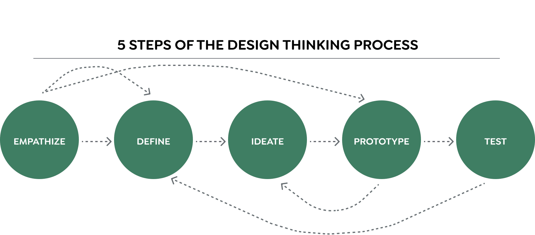
Empathize
SECONDARY RESEARCH
In order to gain a deeper understanding of the issues Enverus PRISM users were experiencing with the alert feature, we conducted secondary research. Our investigation revealed key areas of interest that could be targeted to address user pain points. We learned that:
without alert prioritization, important alerts are often ignored
alert fatigue can occur when monitoring systems generate an excessive number of alerts, causing a decrease in the ability to identify important issues due to the volume of unnecessary or unhelpful notifications
incorporating CRUD operations (create, read, update, delete) into the alert feature was crucial in giving users the essential functionality they need in the app

COMPETITIVE ANALYSIS
Next, we analyzed the alert feature in several analytics apps to pinpoint strong points and areas of improvement. We identified that:
most apps provided the options of automatic and customizable alerts
some apps implemented the possibility to share with or exclude specific groups from receiving alerts in order to reduce alert fatigue
all apps incorporated CRUD operations in some way, although not all interfaces were easy to navigate
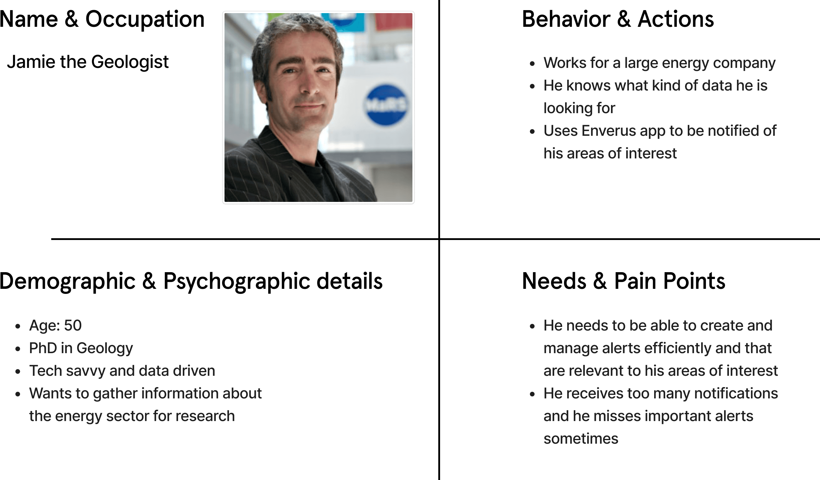
PROTO PERSONA
As we were not able to reach our target demographic of energy experts and investors to obtain new data, we opted to create a Proto Persona based on our secondary research and competitive analysis. I would like to present Jamie, a geologist working in the energy sector and a regular user of the Enverus PRISM app, who represents the user that we would be designing for.
Define & Ideate
PROBLEM STATEMENT
Now that we had a better understand of our target user and their pain points, we needed to define our problem statement:
Energy sector experts need to find a way to be aware of the changes happening to energy infrastructures within their regions of interest but they are experiencing alert fatigue due to receiving too many irrelevant notifications.
IDEATION
Moving forward, we utilized the crazy 8s method to brainstorm potential solutions for our problem. We each presented our ideas and then voted on the enhancements we could potentially design for the alert feature in the Enverus PRISM app. Using the MoSCoW method prioritization technique, we decided on the improvements that we thought were essential to have and which ones we didn’t find necessary. In addition the existing options already in the app, we wanted users to have:
the possibility to prioritize alerts according to their severity level
the option to share alerts with specific team members or external stakeholders
the ability to expand and collapse alerts, allowing users to view notifications specific to each alert
separate sections to create, view and manage alerts
the options to disable, edit and delete alerts
A full-screen bento style alert dashboard featuring color-coded alerts corresponding to their severity level

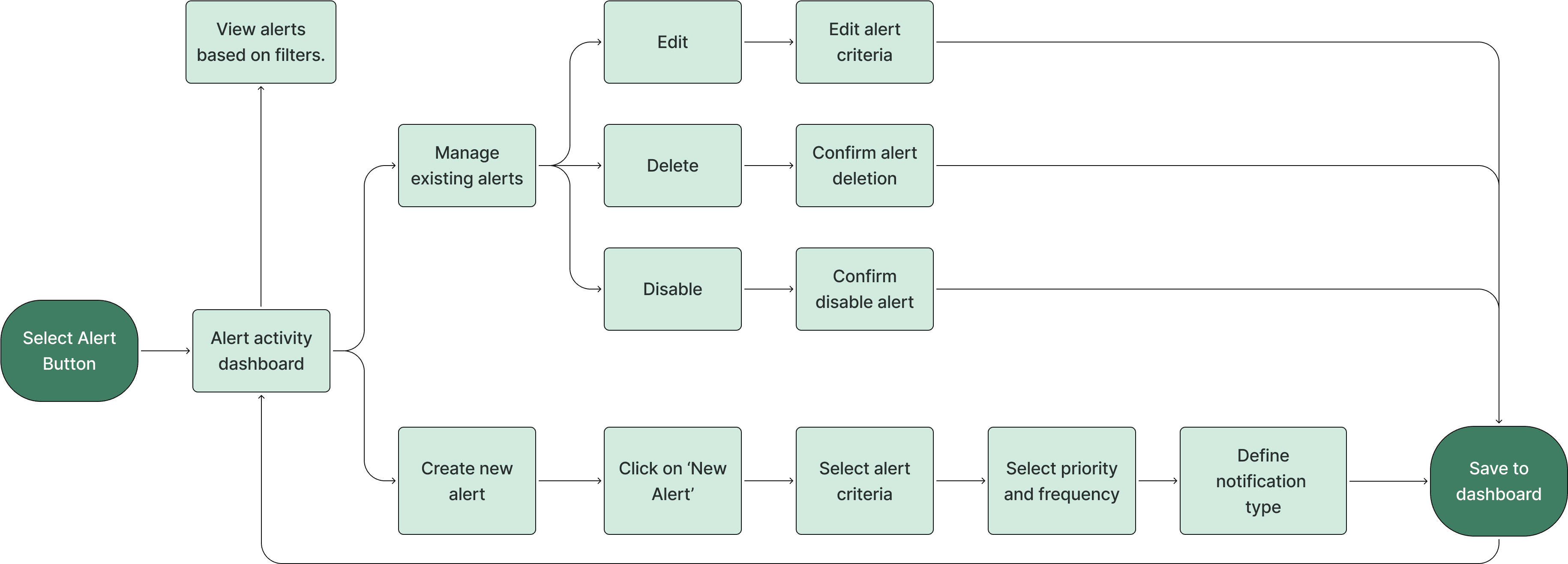
Once we were satisfied with our solutions, we moved on to mapping out user flows to illustrate the steps users would follow to achieve their objectives when using the alert feature. Starting from the alert activity dashboard, the first user flow shows the actions users would perform if they wanted to create a new alert and add it to their dashboard. The second user flow outlines the steps users can follow to manage their existing alerts, whether they wish to edit, delete, or disable them.
Once we were satisfied with our solutions, we moved on to mapping out user flows to illustrate the steps users would follow to achieve their objectives when using the alert feature. Starting from the alert activity dashboard, the first user flow shows the actions users would perform if they wanted to create a new alert and add it to their dashboard. The second user flow outlines the steps users can follow to manage their existing alerts, whether they wish to edit, delete, or disable them.
Once we were satisfied with our solutions, we moved on to mapping out user flows to illustrate the steps users would follow to achieve their objectives when using the alert feature. Starting from the alert activity dashboard, the first user flow shows the actions users would perform if they wanted to create a new alert and add it to their dashboard. The second user flow outlines the steps users can follow to manage their existing alerts, whether they wish to edit, delete, or disable them.
Once we were satisfied with our solutions, we moved on to mapping out user flows to illustrate the steps users would follow to achieve their objectives when using the alert feature. Starting from the alert activity dashboard, the first user flow shows the actions users would perform if they wanted to create a new alert and add it to their dashboard. The second user flow outlines the steps users can follow to manage their existing alerts, whether they wish to edit, delete, or disable them.
Once we were satisfied with our solutions, we moved on to mapping out user flows to illustrate the steps users would follow to achieve their objectives when using the alert feature. Starting from the alert activity dashboard, the first user flow shows the actions users would perform if they wanted to create a new alert and add it to their dashboard. The second user flow outlines the steps users can follow to manage their existing alerts, whether they wish to edit, delete, or disable them.
Once we were satisfied with our solutions, we moved on to mapping out user flows to illustrate the steps users would follow to achieve their objectives when using the alert feature. Starting from the alert activity dashboard, the first user flow shows the actions users would perform if they wanted to create a new alert and add it to their dashboard. The second user flow outlines the steps users can follow to manage their existing alerts, whether they wish to edit, delete, or disable them.
Once we were satisfied with our solutions, we moved on to mapping out user flows to illustrate the steps users would follow to achieve their objectives when using the alert feature. Starting from the alert activity dashboard, the first user flow shows the actions users would perform if they wanted to create a new alert and add it to their dashboard. The second user flow outlines the steps users can follow to manage their existing alerts, whether they wish to edit, delete, or disable them.
Once we were satisfied with our solutions, we moved on to mapping out user flows to illustrate the steps users would follow to achieve their objectives when using the alert feature. Starting from the alert activity dashboard, the first user flow shows the actions users would perform if they wanted to create a new alert and add it to their dashboard. The second user flow outlines the steps users can follow to manage their existing alerts, whether they wish to edit, delete, or disable them.
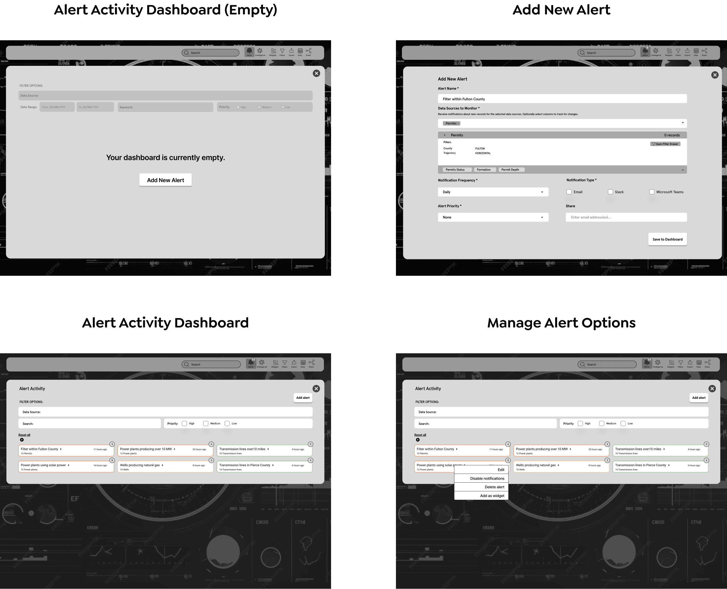
LOW FIDELITY SKETCHES
Our next step was to create our low fidelity diagrams detailing our solutions. After sketching our initial concepts for the alert feature, we evaluated them and selected the ideas to incorporate into our mid-fidelity designs.
LOW FIDELITY SKETCHES
Our next step was to create our low fidelity diagrams detailing our solutions. After sketching our initial concepts for the alert feature, we evaluated them and selected the ideas to incorporate into our mid-fidelity designs.
LOW FIDELITY SKETCHES
Our next step was to create our low fidelity diagrams detailing our solutions. After sketching our initial concepts for the alert feature, we evaluated them and selected the ideas to incorporate into our mid-fidelity designs.
LOW FIDELITY SKETCHES
Our next step was to create our low fidelity diagrams detailing our solutions. After sketching our initial concepts for the alert feature, we evaluated them and selected the ideas to incorporate into our mid-fidelity designs.
LOW FIDELITY SKETCHES
Our next step was to create our low fidelity diagrams detailing our solutions. After sketching our initial concepts for the alert feature, we evaluated them and selected the ideas to incorporate into our mid-fidelity designs.
LOW FIDELITY SKETCHES
Our next step was to create our low fidelity diagrams detailing our solutions. After sketching our initial concepts for the alert feature, we evaluated them and selected the ideas to incorporate into our mid-fidelity designs.
LOW FIDELITY SKETCHES
Our next step was to create our low fidelity diagrams detailing our solutions. After sketching our initial concepts for the alert feature, we evaluated them and selected the ideas to incorporate into our mid-fidelity designs.
LOW FIDELITY SKETCHES
Our next step was to create our low fidelity diagrams detailing our solutions. After sketching our initial concepts for the alert feature, we evaluated them and selected the ideas to incorporate into our mid-fidelity designs.

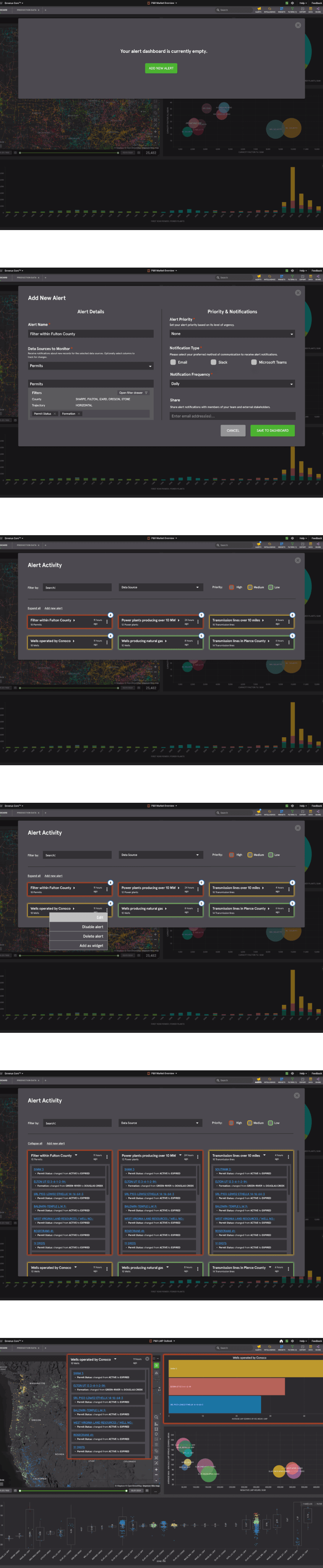
Prototype & Testing
MID-FIDELITY DESIGNS
We then used our sketches to develop the first iteration of our mid-fidelity prototype.
Prototype & Testing
MID-FIDELITY DESIGNS
We then used our sketches to develop the first iteration of our mid-fidelity prototype.
Prototype & Testing
MID-FIDELITY DESIGNS
We then used our sketches to develop the first iteration of our mid-fidelity prototype.
Prototype & Testing
MID-FIDELITY DESIGNS
We then used our sketches to develop the first iteration of our mid-fidelity prototype.
Prototype & Testing
MID-FIDELITY DESIGNS
We then used our sketches to develop the first iteration of our mid-fidelity prototype.
Prototype & Testing
MID-FIDELITY DESIGNS
We then used our sketches to develop the first iteration of our mid-fidelity prototype.
Prototype & Testing
MID-FIDELITY DESIGNS
We then used our sketches to develop the first iteration of our mid-fidelity prototype.
Prototype & Testing
MID-FIDELITY DESIGNS
We then used our sketches to develop the first iteration of our mid-fidelity prototype.
USABILITY TESTING AND DESIGN CRITIQUE
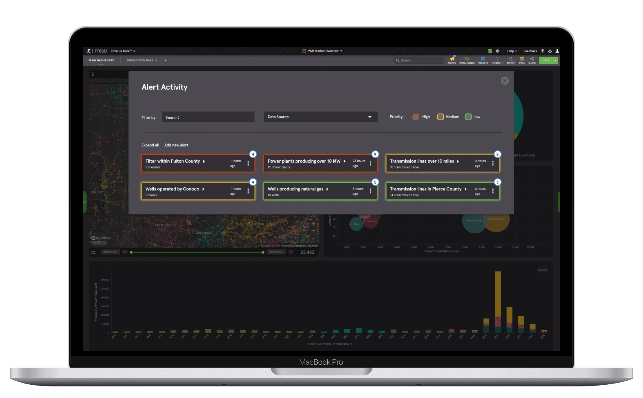
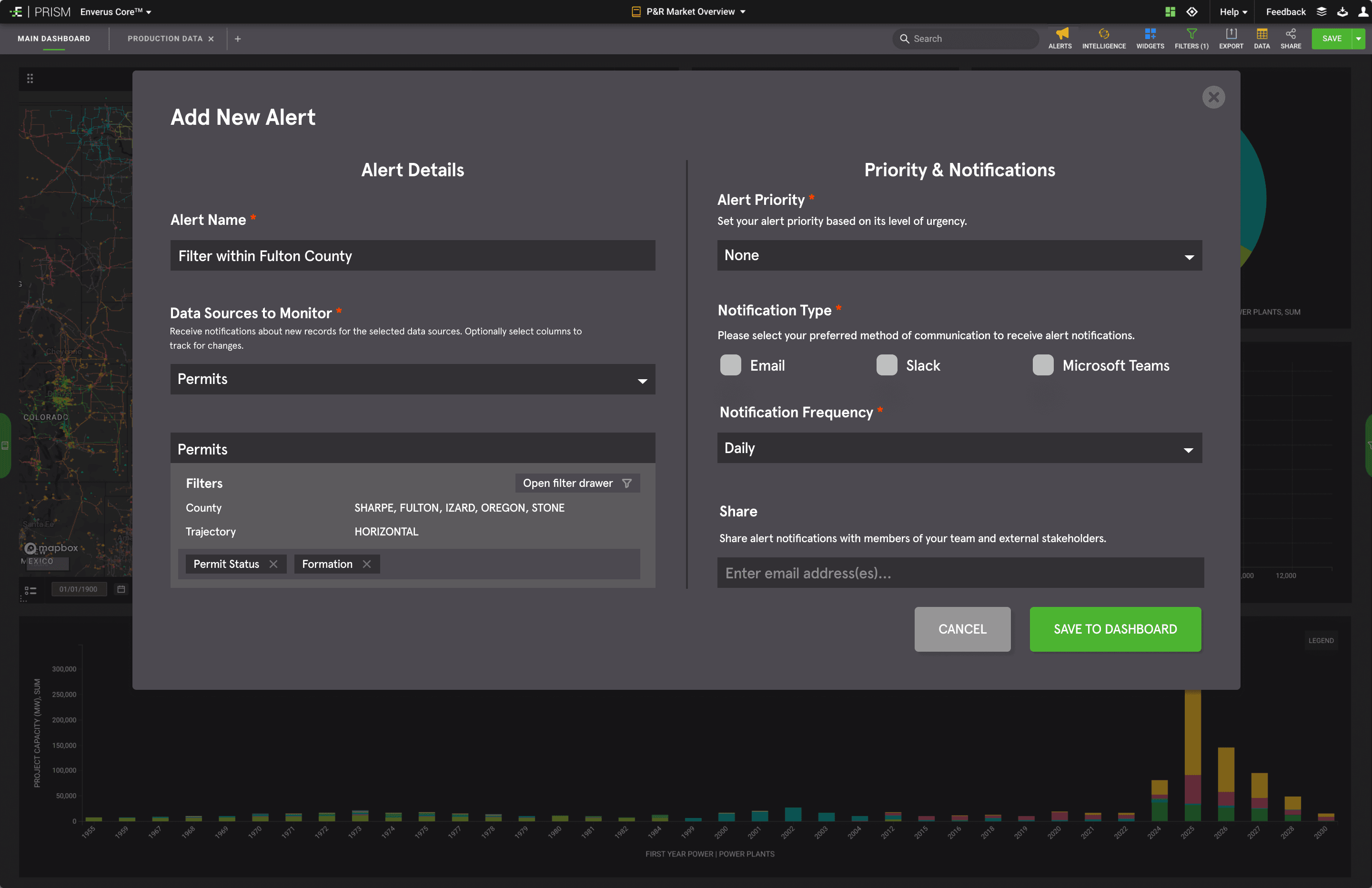
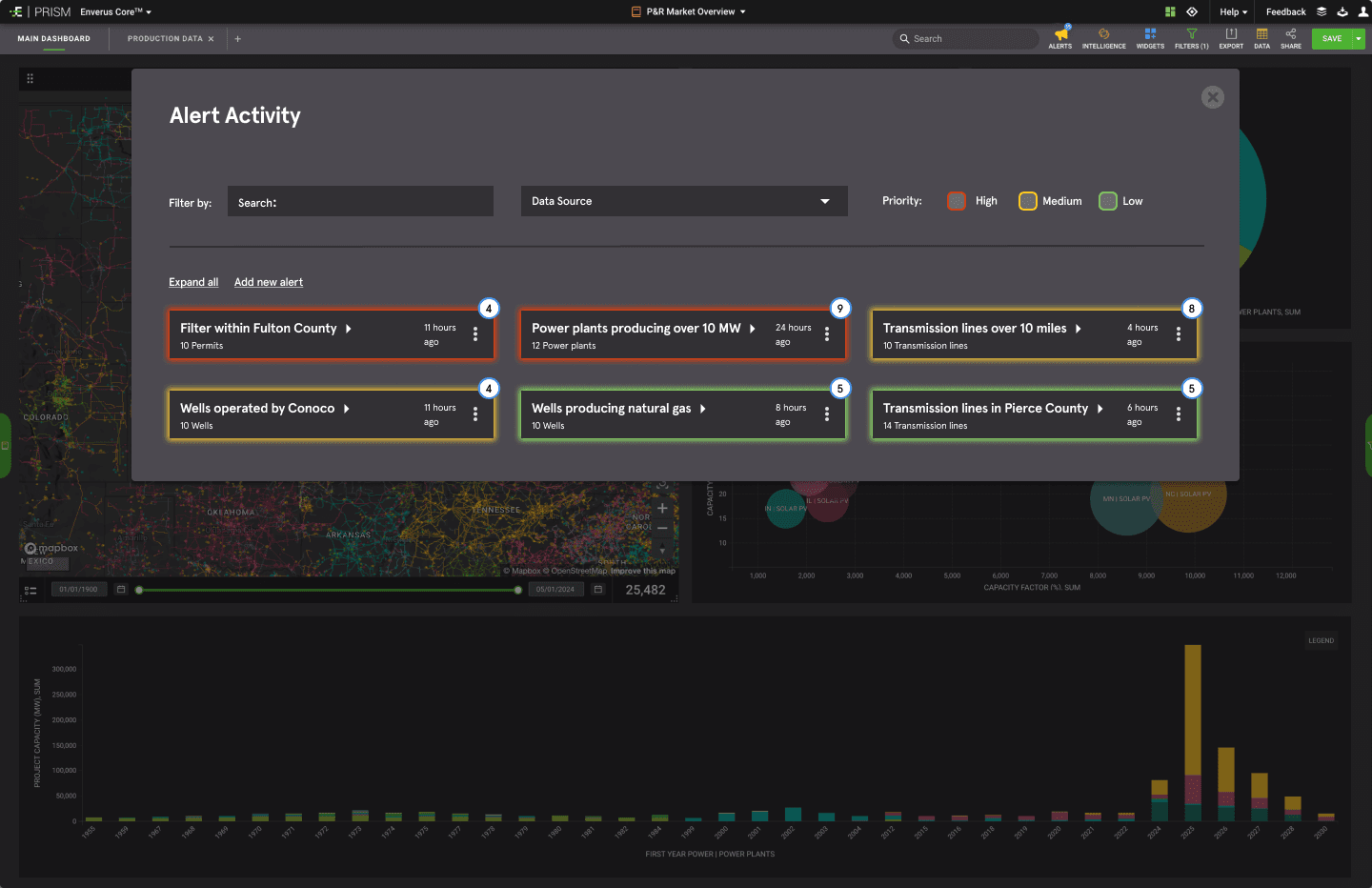
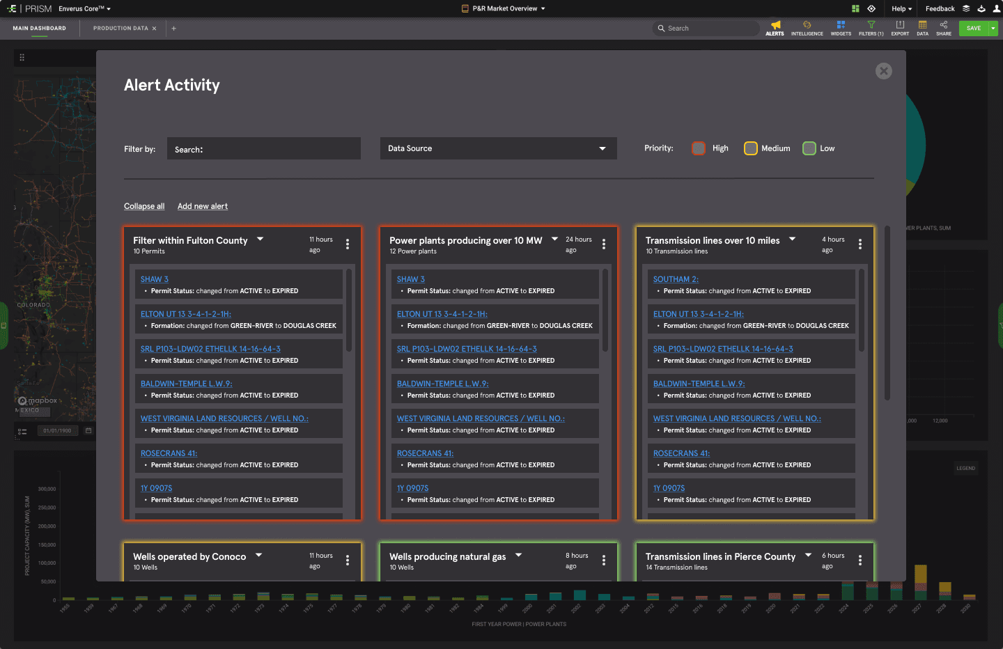
After completing our mid-fidelity prototype, we conducted two rounds of usability testing with a total of 5 participants. We also received feedback from other designers on our revised prototype. While the overall response was positive, there were areas for improvement identified. For instance, users found it difficult to determine the sequence of actions required in the Add New Alert section due to a lack of clear hierarchy. Additionally, the filter options on the Alert Activity Dashboard were found to be visually overwhelming and detracted from the main focus of the alerts. In response to this feedback, we divided the Add New Alert page into distinct sections to clarify which actions to take first, and we decreased the size of filter options on the Alert Activity Dashboard, which can be seen our high-fidelity designs.
USABILITY TESTING AND DESIGN CRITIQUE
After completing our mid-fidelity prototype, we conducted two rounds of usability testing with a total of 5 participants. We also received feedback from other designers on our revised prototype. While the overall response was positive, there were areas for improvement identified. For instance, users found it difficult to determine the sequence of actions required in the Add New Alert section due to a lack of clear hierarchy. Additionally, the filter options on the Alert Activity Dashboard were found to be visually overwhelming and detracted from the main focus of the alerts. In response to this feedback, we divided the Add New Alert page into distinct sections to clarify which actions to take first, and we decreased the size of filter options on the Alert Activity Dashboard, which can be seen our high-fidelity designs.

UI Design
STYLE TILE
We wanted to ensure that our alert feature redesign maintained consistency with the established aesthetic and tone of the Enverus PRISM app. This involved closely aligning our design choices with the existing brand colors, and we crafted a detailed style tile to showcase the updated buttons, icons, menu structure, and semantic colors that would be incorporated into our revised designs.

Final Prototype
After refining our mid-fidelity wireframes and finalizing the UI branding, we proceeded to develop the high-fidelity prototype. You can view our finalized prototype here.
Final Prototype
After refining our mid-fidelity wireframes and finalizing the UI branding, we proceeded to develop the high-fidelity prototype. You can view our finalized prototype here.
Final Prototype
After refining our mid-fidelity wireframes and finalizing the UI branding, we proceeded to develop the high-fidelity prototype. You can view our finalized prototype here.
Final Prototype
After refining our mid-fidelity wireframes and finalizing the UI branding, we proceeded to develop the high-fidelity prototype. You can view our finalized prototype here.
Final Prototype
After refining our mid-fidelity wireframes and finalizing the UI branding, we proceeded to develop the high-fidelity prototype. You can view our finalized prototype here.
Final Prototype
After refining our mid-fidelity wireframes and finalizing the UI branding, we proceeded to develop the high-fidelity prototype. You can view our finalized prototype here.
Final Prototype
After refining our mid-fidelity wireframes and finalizing the UI branding, we proceeded to develop the high-fidelity prototype. You can view our finalized prototype here.
Final Prototype
After refining our mid-fidelity wireframes and finalizing the UI branding, we proceeded to develop the high-fidelity prototype. You can view our finalized prototype here.


Conclusion & Takeaways
In conclusion, the process of redesigning the Enverus Prism app alert feature has been a valuable learning experience that has allowed us to apply our design skills and creativity to a real-world problem. We were able to collaboratively ideate, prototype, and iterate on designs to create a more user-friendly and visually appealing alert feature. Presenting our designs to Dennis, our Enverus stakeholder, was a valuable experience, and our next step would be to move on to usability and concept testing with actual Enverus users.
One of the main challenges we faced during this project was the difficulty in reaching our target demographic for research and testing. This highlighted the non-linear nature of the design thinking process and the importance of flexibility and adaptability when working on projects of this nature. Despite these challenges, we are confident that our designs would positively impact the user experience of this feature.
Read Next…
Read Next…
Read Next…
Read Next…
Read Next…
Read Next…
Read Next…
Read Next…
Weborama
Redesigning a creative advertising platform for seamless campaign creation and integration.
Weborama
Redesigning a creative advertising platform for seamless campaign creation and integration.
Weborama
Redesigning a creative advertising platform for seamless campaign creation and integration.
Weborama
Redesigning a creative advertising platform for seamless campaign creation and integration.
Weborama
Redesigning a creative advertising platform for seamless campaign creation and integration.
Weborama
Redesigning a creative advertising platform for seamless campaign creation and integration.
Weborama
Redesigning a creative advertising platform for seamless campaign creation and integration.
Weborama
Redesigning a creative advertising platform for seamless campaign creation and integration.

